
Candy Hole mobile version for Android and iPhone
The mobile version preserves the full dessert field, coefficient display and round interface while adapting graphics, controls and information density to Android and iPhone screens.
The mobile version preserves the full dessert field, coefficient display and round interface while adapting graphics, controls and information density to Android and iPhone screens.
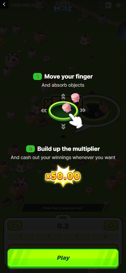
Responsive rendering in current mobile browsers.
Portrait presentation suited to Safari screens.
The dessert field scales without changing the product.
Balance, coefficients and round data remain visible.
| Mobile characteristic | Android | iPhone |
|---|---|---|
| Browser format | Responsive canvas in current browsers | Responsive canvas in Safari |
| Primary orientation | Portrait with landscape support | Portrait with landscape support |
| Graphics | Hardware-accelerated canvas | Hardware-accelerated canvas |
| Field composition | Tall dessert layout | Tall dessert layout |
| Audio and settings | Compact top controls | Compact top controls |
| Information density | Large actions and concise labels | Large actions and concise labels |
The Android presentation uses a responsive game canvas rather than a separate reduced catalogue. The Candy Hole logo, balance area, dessert field, coefficient labels and lower round panel remain part of the same product seen on desktop. Current mobile browsers provide the viewport in which the animated field is scaled and positioned.
Android phones vary widely in screen ratio and graphics hardware, so the interface relies on flexible dimensions instead of one fixed resolution. Narrow displays prioritise the central hole and nearby objects, while wider devices reveal more of the green field. Top utility controls and lower status information remain anchored outside the busiest object area.
The iPhone version presents the same game through a portrait layout suited to Safari. Its taller field places dessert objects above and below the central interaction area, while the logo and compact utility controls remain close to the upper edge. The result is recognisably Candy Hole rather than a simplified mobile substitute.
High-density iPhone displays preserve outlines around cakes, berries, waffles and coefficient values. The large lower action area occupies most of the available width, which prevents important round information from being compressed into small controls. Screen scaling keeps the interface readable across standard and larger iPhone formats.
Portrait is the defining mobile format in the supplied example. It shows a vertical section of the dessert field and stacks interface information without removing the game background. Landscape can expose a broader area that is closer to the desktop composition, but both orientations use the same assets, colours and round state.
The game does not need separate Android and iPhone artwork sets. Responsive scaling changes the visible field area and element dimensions while preserving the product hierarchy. Logo and utilities remain at the top, the interactive field occupies the centre, and primary round information stays near the lower edge.
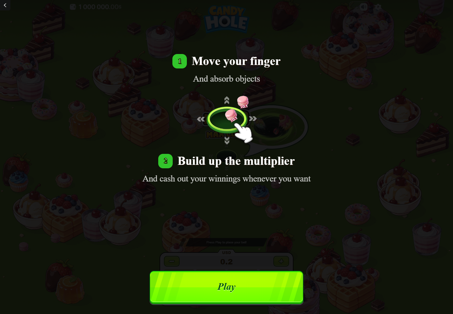
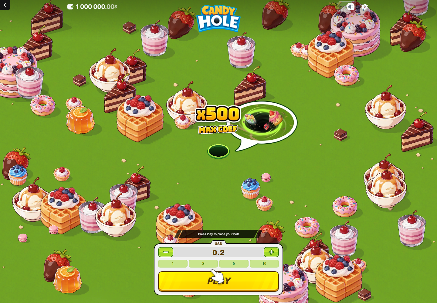
The dessert field contains objects with very different visual sizes, from crumbs and macarons to waffles, cakes and ice-cream bowls. Mobile rendering retains those scale differences while reducing the amount of field visible at one time. Strong outlines and saturated colours help each object remain distinct on a smaller display.
Coefficient labels use large characters with contrasting borders, allowing them to remain readable over complex artwork. The bright green field separates the objects from the dark hole, while red fruit, pink desserts and orange waffles provide additional colour contrast. This visual system is preserved on both Android and iPhone.
Candy Hole is rendered as an animated game field inside the browser viewport. Mobile performance therefore depends on canvas rendering, available memory and graphics acceleration rather than ordinary page text alone. The loading screen prepares art and game assets before the interactive field becomes visible.
Recent Android devices and iPhones can display the intended layering, movement and coefficient feedback through current browsers. Larger dessert objects and animated transitions require more graphics work than the static information panels. The responsive engine balances the visible field area with the phone resolution instead of loading a separate low-detail design.
The mobile session begins with a branded cyan loading screen containing the Candy Hole logo, floating sweets, progress bar and percentage. This separates asset preparation from the green live field. The same loading identity appears regardless of whether the session is opened on Android or iPhone.
Once the assets are available, the product moves to the portrait game presentation without changing pages. A stable connection supports the initial transfer of dessert artwork and interface resources, while the running game relies primarily on local rendering. Reopening the product can still display the loading state when a fresh asset session is required.
The phone layout uses a compact top bar and a wide lower control area. Balance information, logo, sound and settings remain separate from the animated field. This prevents utility elements from competing visually with desserts and coefficient labels in the centre of the screen.
Text is limited to short labels and numeric values inside the game interface. Larger descriptive information appears on Candy-Hole.com rather than being placed over the mobile canvas. This division keeps the game screen focused while the product page provides Android and iPhone characteristics in a structured, searchable format.
Sound and settings use compact icon controls at the top of the mobile screen. Their placement is consistent with the desktop version, although the available horizontal space is smaller. The back control stays on the opposite side, creating a clear separation between navigation and game configuration.
Audio belongs to the live product layer and can be controlled without covering the field with a permanent text menu. The settings icon also remains available during the mobile session. Exact options can depend on the current game build, but the entry points and their top-bar positions are visible in the supplied mobile example.
The mobile interface retains the selected currency, stake value, demonstration balance, coefficient feedback and current round result. These values are not replaced by abbreviated icons. Before a round, the lower panel contains the numeric amount and quick values; during a round, the available result occupies the lower action area.
This continuity is important because the phone screen reveals less of the field than a desktop monitor. Stable numeric information provides context while the dessert scene moves. Android and iPhone therefore use the same data hierarchy even though screen dimensions and the number of simultaneously visible objects can differ.
The mobile version keeps the Candy Hole logo, cyan loading colour, green field, neon action colour and dessert artwork associated with the main game. It does not substitute generic casino imagery or a separate list of titles. The result is one recognisable product adapted to a different viewport.
Candy-Hole.com presents this page as mobile product information focused on Android and iPhone characteristics. Compatibility, display formats, performance, graphics, audio and interface density are covered here, while gameplay and control details remain available on their own dedicated pages.
The partner page opens in a new tab with its current game interface and account options.